

Small business website design: From brief to launch
A strong business website answers three questions quickly: What do you offer, why should I trust you and how do I reach you? Use this guide to turn those questions into a brief, a set of pages and a launch test.
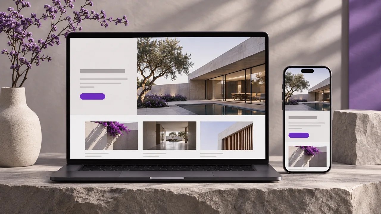
Choose between a landing page, a business site and an online store
A campaign with one offer and one enquiry route may only need a landing page. A business with several distinct services usually needs a homepage and separate service pages so people can land on the relevant offer from search. An online store adds product discovery, catalogue management, checkout, inventory and fulfilment. Decide based on what visitors need to do, then budget for the system that supports it.
Write down the main audience, two questions they typically ask, the proof you can show and the action you want them to take. A renovation company might choose quote requests with a location, timeframe and project type. An online gift shop might prioritize finding an item in stock and seeing the delivery deadline before checkout. A single brief shouldn’t treat those goals as interchangeable.
Give each important page one job
- Homepage: explain the offer and let visitors choose the right service or category quickly.
- Service pages: describe the scope, show relevant work and explain what happens after an enquiry. Include a useful price range or starting price if you can stand behind it.
- Portfolio and About: show what you did and who is responsible for the work. Use real examples where you have permission; label concepts clearly.
- Contact: ask for the information you actually need. Provide another way to reach the business and test the whole path from sending to receiving.
For example, an architecture studio can put a single residential project beside its consultation link, show one floor plan with a caption, then explain what the first call covers. That gives a visitor a reason to enquire and a clear next step without promising that every project is priced or scheduled the same way.
Test responsive web design on a real phone
Start with the narrow screen: confirm the first heading can be read without squinting, buttons have space around them and the navigation works without a mouse. Open the page with larger text and on a slower connection. If the form has a drop-down or supports multiple languages, test it in each layout. Check labels, keyboard focus and validation messages instead of assuming the design will behave the same as its mockup.
For performance, use appropriately sized images, set their dimensions so the layout stays steady and avoid loading a large animation before the first useful text. The Core Web Vitals guide separates loading (LCP), interaction responsiveness (INP) and layout stability (CLS). A single Lighthouse run is a useful diagnostic; it doesn’t replace real visitor measurements once the site has enough traffic.
Make the site easy to find and understand
Give each service a readable URL, a descriptive title and one clear main heading. Use the words a customer would use: “multilingual online store design” says more than “digital solutions.” Put real answers in the text, reference related services with useful links and write alt text for meaningful images. Keep final URLs in the sitemap; if replacing an old site, map changed addresses to the closest new pages.
Where the business serves multiple languages, localize the actual page, including navigation, service terms and the contact flow. Give each real translation its own URL. For example, preserve a Hebrew path and its right-to-left layout rather than swapping only the headline on the English page.
Run a launch test before you switch the domain
- Ask someone who hasn’t seen the project to find a relevant service on a phone.
- Check that they can explain what the business does and complete the primary action without help.
- Confirm the enquiry reaches the real inbox, the old links go to the right pages and the site uses HTTPS.
- Agree who owns the domain, hosting, site files and future content updates. Record who can restore the previous release.
When you brief SENDOWEB for a new build or redesign, send your current address, the services that need their own page and the main action you want visitors to take. Those decisions give us a better start than a list of visual references alone.